Prakriti
01 / 04An identity that grows across a product family.
A continuing client relationship
From one label to a family.
The paid engagement began with individual product labels and expanded over six months into a visual identity and catalogue for the complete range.
An information system
Related, but easy to tell apart.
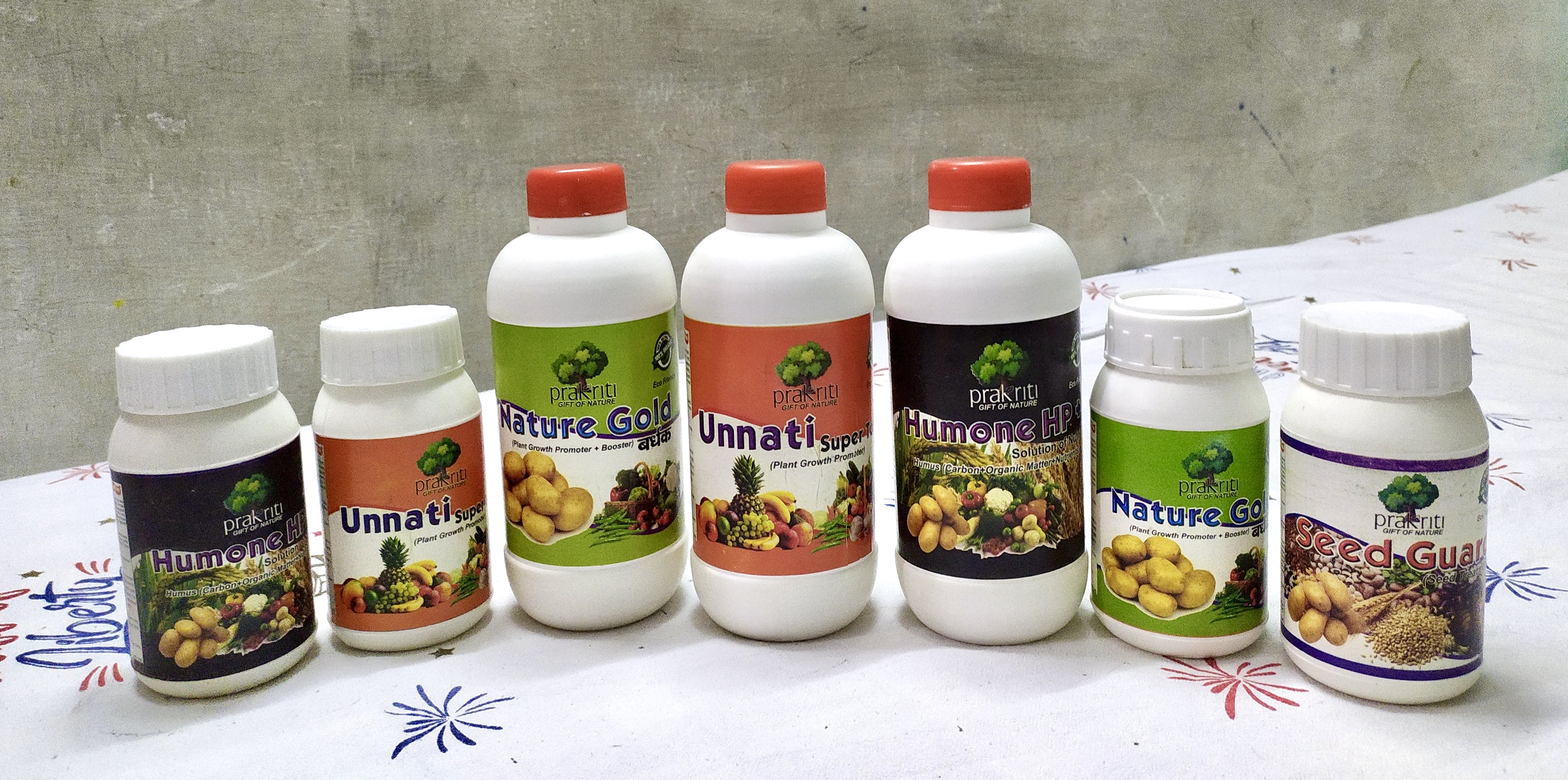
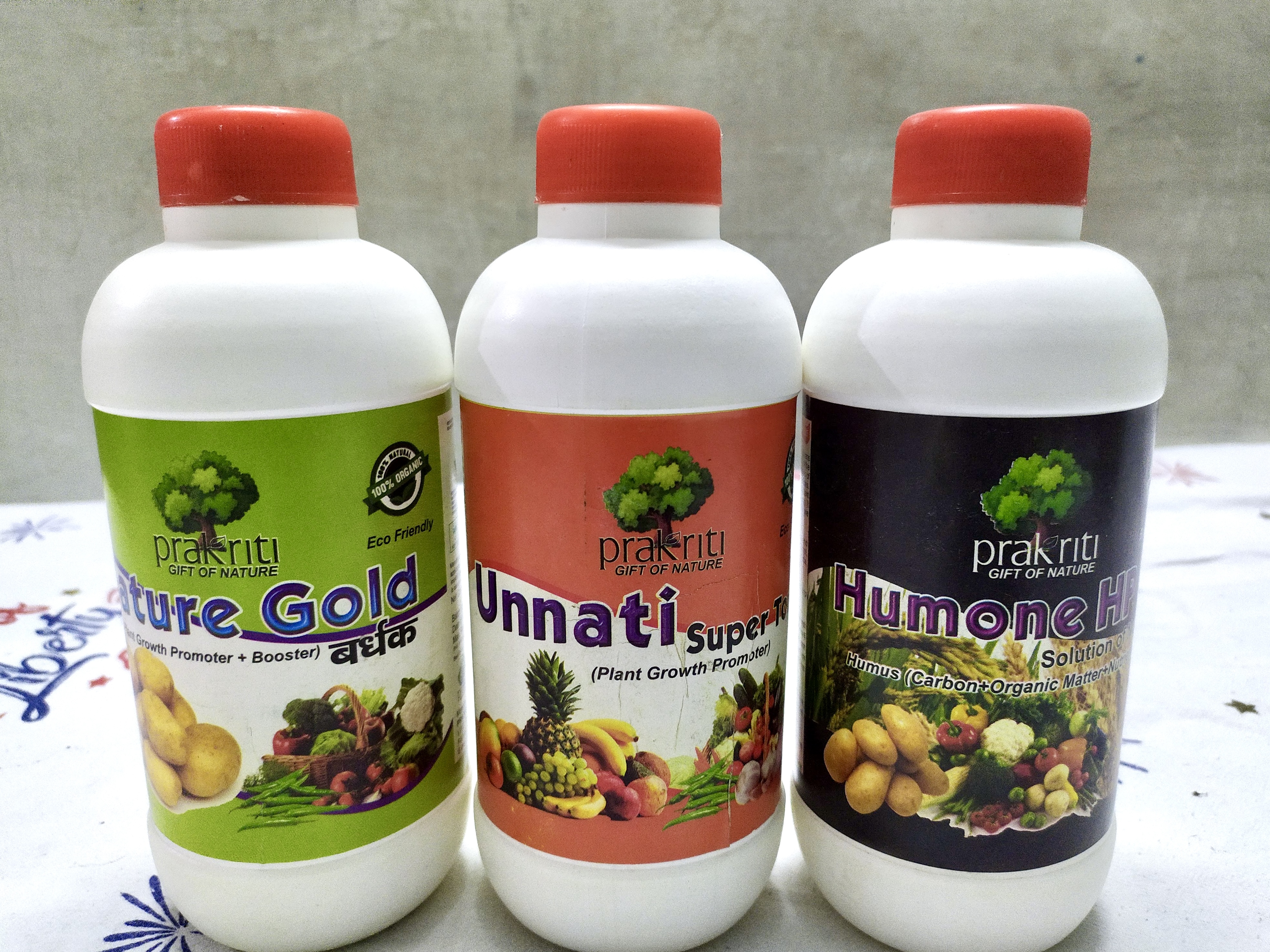
Each label follows the same layout, with different colours and images to distinguish the products.
Across the product range
One identity, different containers.
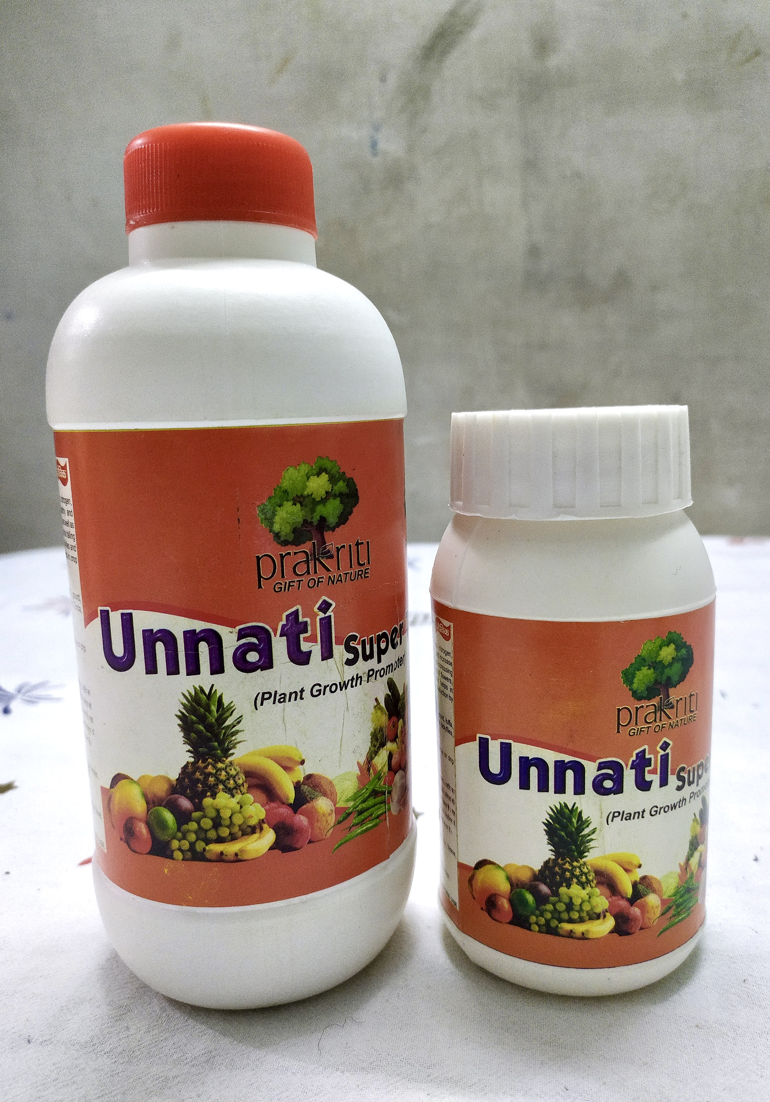
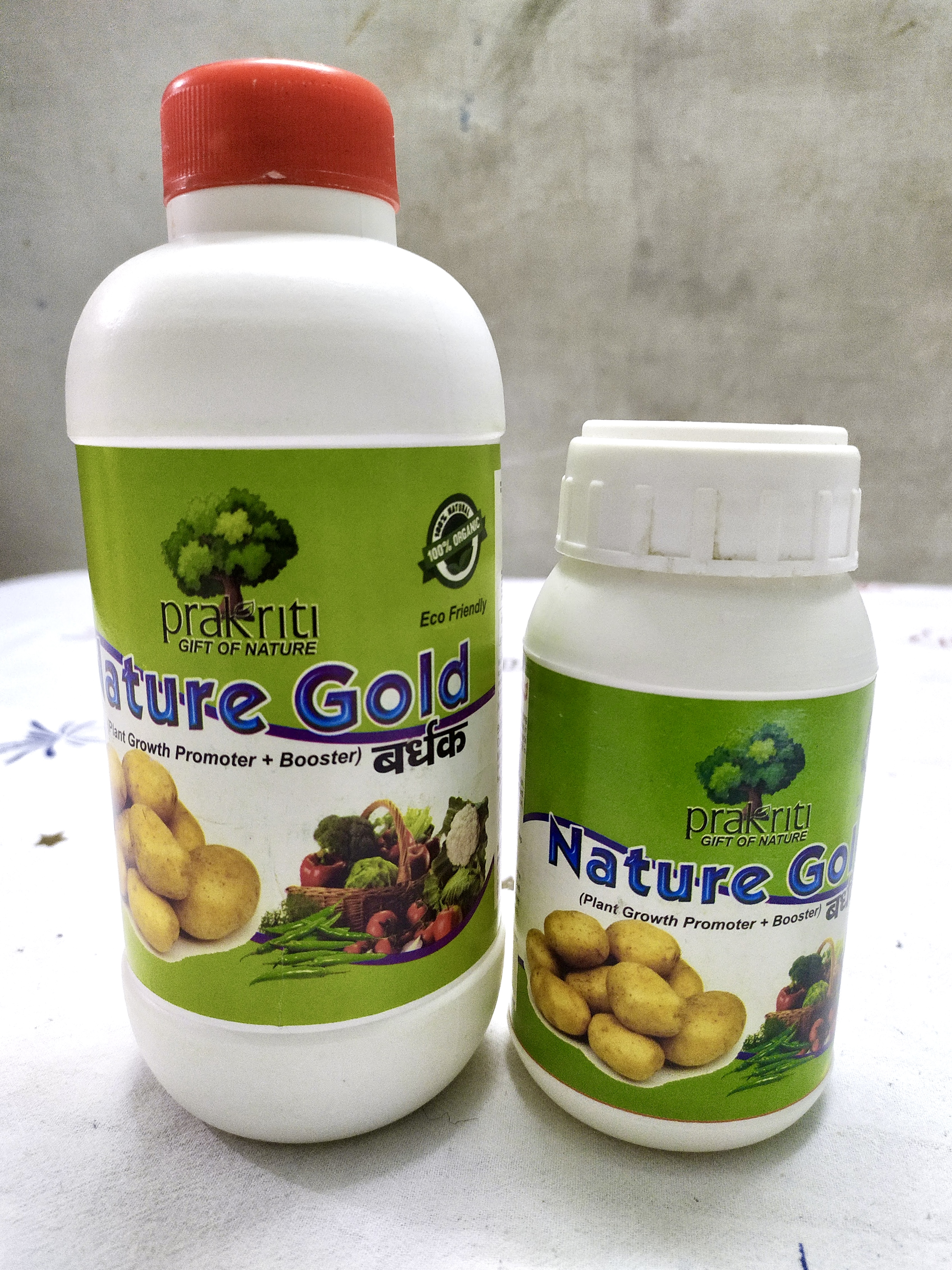
The visual system was adapted across sacks and bottles while keeping product information clear and each formula recognisable.
Made for the market
Designed to be used.
The printed labels were used on products sold in the market, and the catalogue was distributed to local sellers for use with farmers.
The complete
working set.
Labels, identity and catalogue pages. Open any piece to inspect it closely.