Dopamix
03 / 04A studio for ideas
that deserve to move.
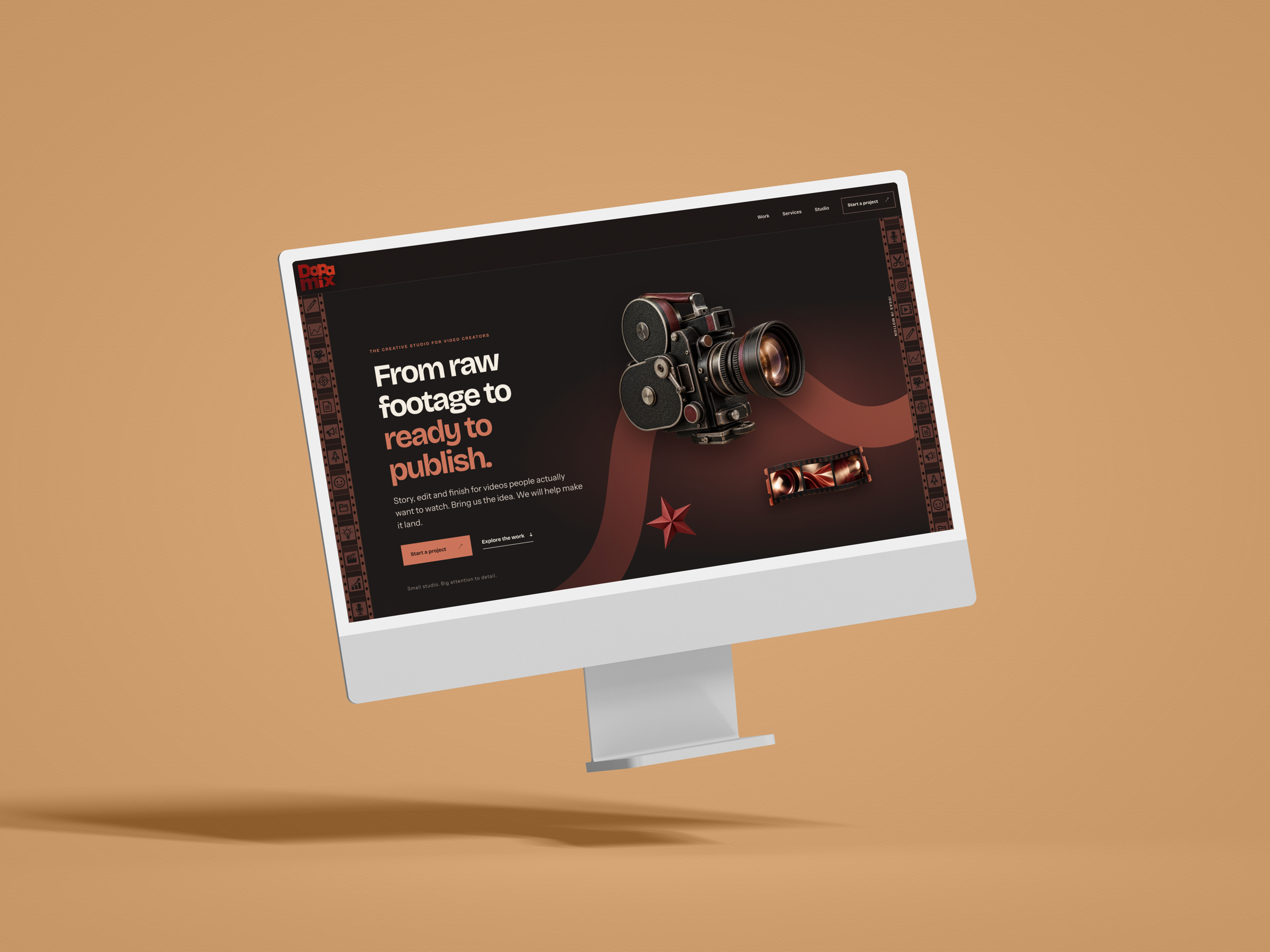
A clear home
for a creative studio.
Dopamix brings story, editing and finishing together for video creators. The identity and website give that work a recognisable voice, from the first impression to the project enquiry.
- Context
- Paid engagement
- My contribution
- Visual identity, digital art direction and website copy
- Scope
- Wordmark, visual language and website design
- Current stage
- Website in development
The brief
Explain a broad creative offer without making the studio feel anonymous or the services difficult to navigate.
The approach
Pair a warm editorial voice with film imagery, tactile details and a clear route through the work, services and process.
Compact mark.
Expressive surroundings.
The stacked wordmark anchors a visual language built around the tools and textures of making video.
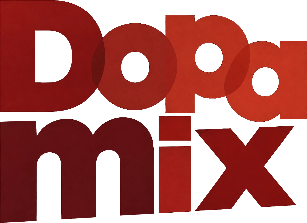 THE STUDIO WORDMARK





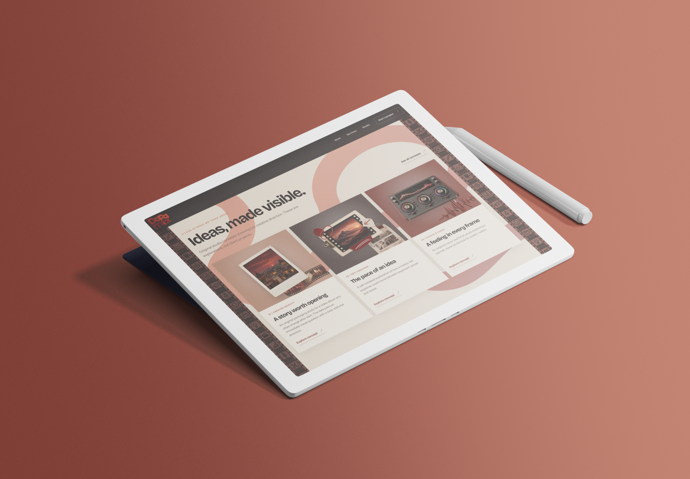
Warmth, with contrast.
Dark grounds give the imagery space. Cream keeps the reading comfortable. Warm red directs attention.
Warm charcoal
#1D1918The main website ground.
Paper cream
#F3EADBHeadlines and light surfaces.
Warm red
#C97058Actions and emphasis.
Deep wine
#511515A supporting identity colour.
Grotesque
Sans
A system you can see.
Each part has a job: invite attention, explain the offer or help someone take the next step.
Say the useful thing first.
A direct headline explains what the studio does. Supporting copy adds detail without competing with it.
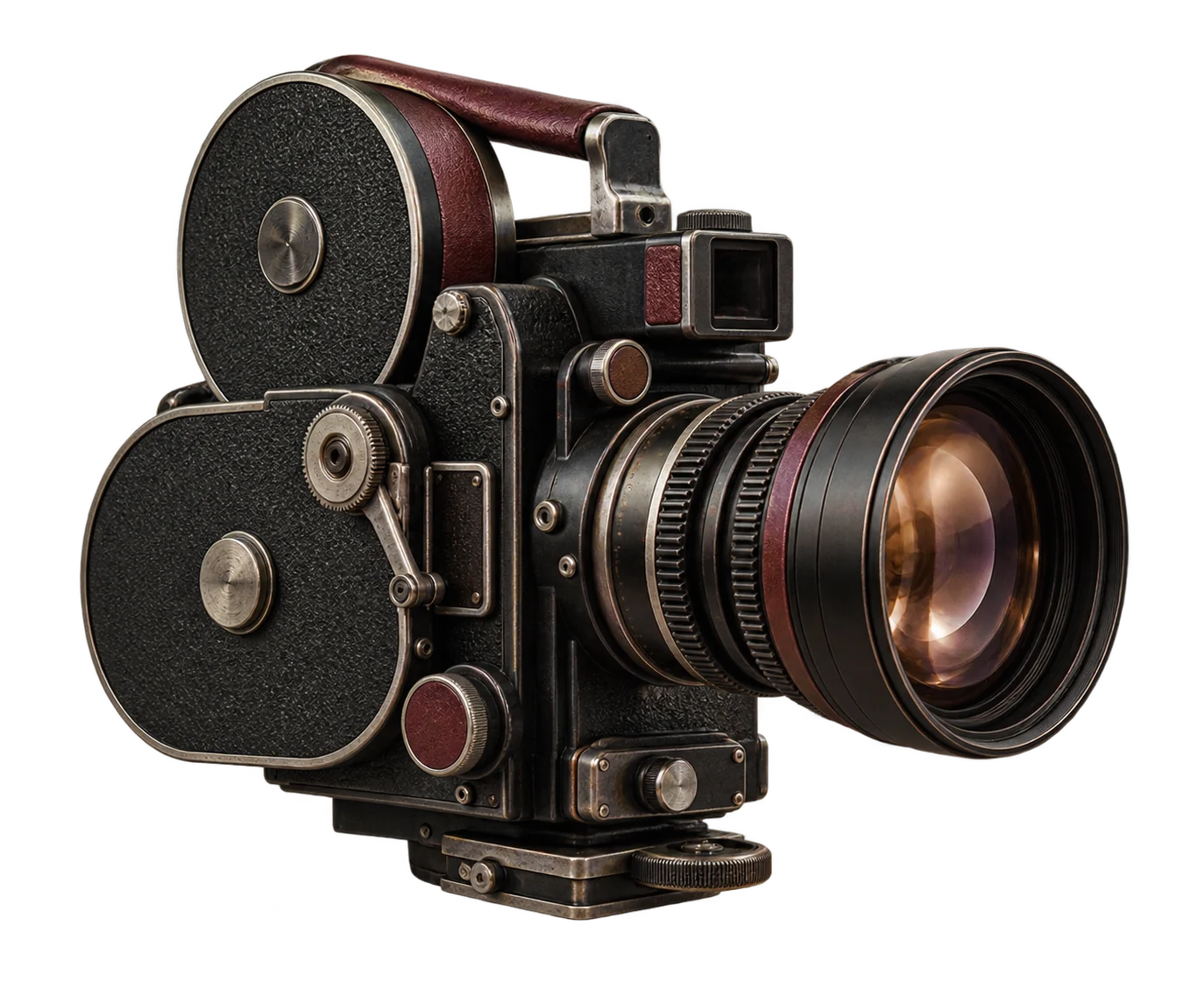
Make the craft visible.
Film equipment, paper and production details bring a tactile quality to the digital experience.
Give every service a place.
Related services sit together, helping visitors understand the offer and find a starting point.
All the parts.
One point of view.
The current homepage, from first impression to final invitation.
Explore the working websiteIdentity, art direction and words.
A visual world built around the work.